

In the modern era where data is king, transforming raw data into visual maps transcends mere aesthetics and becomes a vital strategic tool. As we grapple with the ever-increasing volumes of data produced every day, the demand for potent visualization tools is at its peak.
According to a recent study, managers are 28% more likely to discover timely information in organizations using visual data recovery solutions compared to those relying on traditional reporting and dashboards. This statistic underscores the critical role of data visualization in modern business environments, where making informed decisions quickly can be a significant competitive advantage.
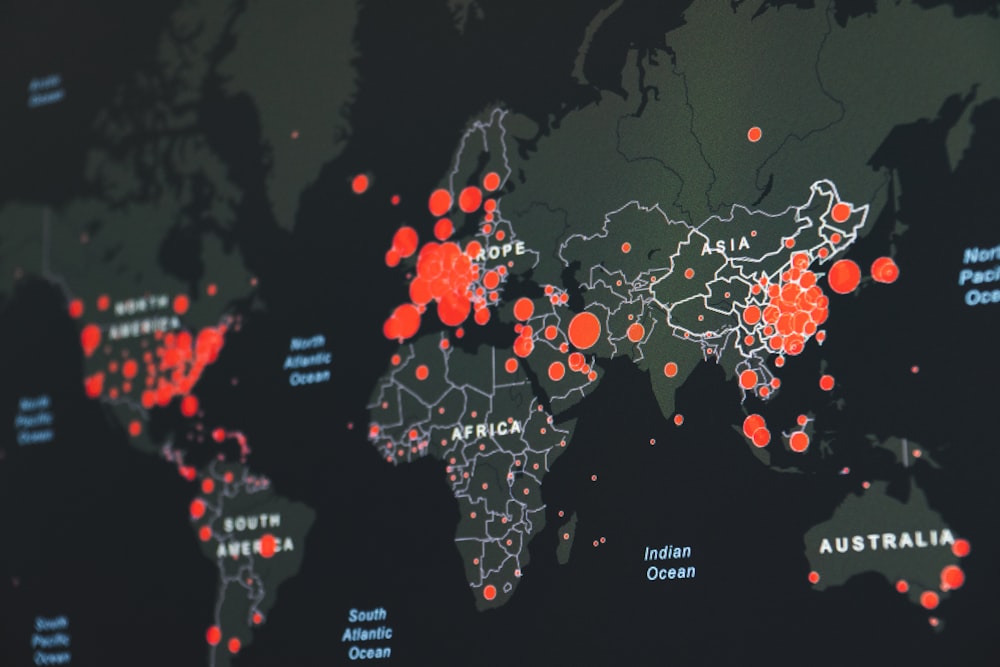
Maps, in particular, offer a unique and powerful medium to represent complex data geographically, making it easier to identify trends, patterns, and outliers. By transforming rows of data into colorful, interactive maps, we can not only understand our world better but also communicate our findings more effectively.
In this post, we’ll explore the nuances of turning dry, numerical data into vibrant, informative maps, offering a step-by-step approach to anyone looking to harness the power of geographical data visualization.
Choosing the Right Mapping Tool
The journey of data transformation begins with selecting the appropriate mapping software. The best mapping tool should match your technical expertise and the specific needs of your data. Look for software that offers user-friendly interfaces for those with limited coding knowledge but also provides advanced options for seasoned users. Also, check for regular updates and community support, which are crucial for long-term utility.
Key features to consider include compatibility with various data formats, extensive customization capabilities, and efficient data integration. Integrating mapping tools with other applications and platforms can offer notable benefits. The ideal tool should facilitate effortless data visualization while maintaining the richness and depth of your analytical insights.
Organizing and Preparing Your Data
The effectiveness of your map hinges on the quality of your data. Begin by meticulously organizing your dataset. Consider categorizing data into logical groups to enhance clarity in your maps. Ensure that your data is clean, accurate, and formatted correctly for the mapping software you’ve chosen. Pay close attention to geographical details like addresses, zip codes, and landmarks, as these are the pillars of your map’s accuracy.
Regular audits of your data can ensure ongoing accuracy and relevance. Incomplete or erroneous data can lead to misleading maps, so take the time to verify and tidy up your data set. Data pre-processing, like normalization and aggregation, can also be beneficial. This step, albeit time-consuming, is the foundation of a map that accurately represents your data story.
Customization Techniques
After preparing and uploading your data into the mapping software, the stage is set for you to infuse it with life through customization. This is the moment when your creative flair comes into full swing. Use color schemes to differentiate data points and layers to add depth to your map.
Customizing markers and icons can provide an intuitive understanding of the data points they represent. Think of your map as a canvas, where each element—be it color, size, or shape—adds meaning and clarity to your data narrative. Through thoughtful customization, you transform a mere geographical representation into an engaging, informative visual story.
Utilizing Advanced Features for Deeper Insights
To extract the maximum value from your data, leverage the advanced features your mapping tool offers. Heat maps can visually represent data density and intensity, making it easier to spot trends and patterns.
Route optimization features are invaluable for logistics and transportation analysis. Utilizing clustering techniques enhances the understanding of how data points are distributed. Such sophisticated features provide a deeper dive into your data, revealing insights that may remain hidden in conventional charts or spreadsheets.
Sharing and Collaborating
A map’s true essence is unlocked when it is effectively shared and comprehended by others. Whether it’s for a client presentation, team collaboration, or public engagement, your map needs to be both accessible and easily understandable to your intended audience. Utilize the sharing and collaboration features of your mapping software.
Consider the different needs of your audience; some may require an interactive map they can explore, while others might need a static image for a report. By tailoring the sharing options, you ensure that your map reaches its audience in the most effective way.

Final Thoughts
Mapping raw data is more than just a technical exercise; it’s an art form that brings data to life. By following these steps, you can transform columns of numbers and words into a compelling visual narrative.
The right mapping tool, coupled with careful data preparation, thoughtful customization, and the use of advanced features, can elevate your maps from mere illustrations to powerful tools of insight and engagement. Remember, a well-crafted map not only tells a story but also invites its viewers to explore, understand, and engage with the data in meaningful ways.
 BlueFinity Enriches Evoke Platform with Extended MV Integrations
 Over $600 Million in Credit Limits Submitted on DP World Trade Finance Platform
 El Florido Boosts Its Supply Chain with Infor WMS
 How AI Can Help Defense Contractors Weather Today’s Uncertain Times
 Omnichannel in Industrial B2B is the New Normal Reveals Epicor Study
 GoTo Plans ChatGPT Integrations for GoTo Resolve