

Tight deadlines. Chaotic data dumps. A blank slide staring back at you. A recent survey shows teams lose thirty-seven percent of PowerPoint prep time wrestling charts and layouts instead of sharpening the story (EmpowerSuite survey). Those lost hours breed late-night decks, slow decisions, and glazed-over stakeholders. The fix? A new wave of add-ins—some AI, some smart data connectors—that handle the grunt work and give you the time back.
This guide ranks the top six based on speed to value, automation depth, visualization muscle, enterprise readiness, and true cost. Ready to trade manual drudgery for insight-first storytelling? Let’s dive in.
How we picked the winners
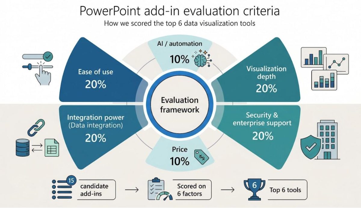
Before we crown any champions, we owe you total transparency on our judging process. We began with a long list of fifteen PowerPoint add-ins that promised faster data storytelling. Each tool faced a six-factor test rooted in real supply-chain work, not marketing claims.
Ease of use and integration power carried the most weight—twenty percent each—because a plug-in that feels clunky or refuses to reach your data sources never clears IT. Visualization depth and AI automation held another twenty and ten percent, rounding out the speed-and-clarity equation. Price added ten percent, since value matters more than absolute cost. Security and enterprise support filled the final twenty percent, a must for any team moving sensitive demand or inventory numbers.
Every factor came with a simple question: Does the tool cut slide-prep hours? Can it link to the live Excel sheet feeding tomorrow’s S&OP meeting? Will the chart still look boardroom-ready after you tweak a label? Most importantly, will your CISO sleep at night?

We answered those questions three ways: vendor documentation, hands-on testing in a live PowerPoint sandbox, and candid feedback from operations analysts on Reddit and industry Slack channels. We normalized the scores, tallied them, then balanced the math with qualitative notes on quirks and wow moments.
Only six tools cleared the bar for speed, clarity, and enterprise trust. That list follows—ranked from solid to standout. Everything else fell short on at least two weighted factors, often security or true time savings.
With the ground rules set, let’s start the countdown.
#1 Plus AI: draft the deck while the coffee brews
Slides generated stay fully editable—bars, labels, and underlying data remain native PowerPoint objects, not flattened images (plusai.com).
Plus AI works like autopilot for slide creation. Open the pane, type a prompt—“Visualise last month’s inventory turns by region, then outline improvement actions”—and the add-in builds branded slides in under a minute. It applies your corporate template so fonts, colours, and logos land exactly where design guidelines expect them.

Plus AI PowerPoint add-in generating branded slides from a prompt
Speed is only half the story. Because Plus AI builds every chart with PowerPoint’s native engine, nothing is flattened. Bars, labels, and data sheets stay fully editable. If the Asia figures arrive ten minutes before the call, overwrite the numbers and the visual updates instantly.
Security teams breathe easy. The service holds a SOC 2 Type II report and encrypts data in transit and at rest, matching enterprise compliance checklists line by line. Single sign-on, template locking, and optional white-glove onboarding round out the governance picture.
Where Plus AI truly shines is repetitive reporting. Feed it last quarter’s deck, ask for an update, and it drafts the new version in seconds. Analysts save hours and invest that time in root-cause insights instead of box-align gymnastics.
Limitations remain. The tool sticks to the chart types PowerPoint already knows. Need a Marimekko or waterfall with subtotal logic? Pair Plus AI with Think-Cell and you have analysis and aesthetics in one workflow.
For teams drowning in slide churn, Plus AI is the fastest route from raw analysis to a polished, on-brand story. It earns the top spot not by adding more buttons, but by erasing busywork altogether.
#2 Think-Cell: consultant-grade charts in a coffee break
Speed and sophistication rarely travel together, but Think-Cell proves they can. The add-in bolts onto PowerPoint and turns the basic chart menu into a toolkit of more than forty options, including waterfalls, Marimekkos, and Gantt timelines.
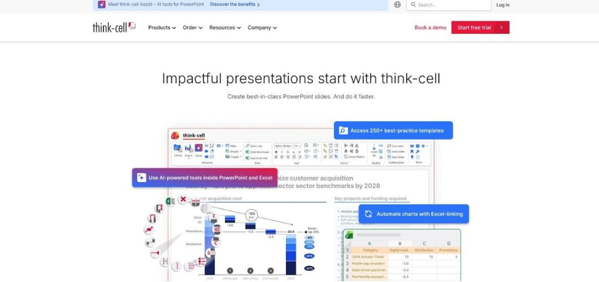
Think-Cell waterfall chart and advanced PowerPoint visuals screenshot
We start with a familiar Excel table. Click Insert Waterfall, paste the data, and Think-Cell auto-labels totals, growth arrows, and CAGR call-outs. Need a last-minute scenario? Edit the source numbers and the slide refreshes instantly with formatting intact. Work that once took an analyst an hour now fits between meetings.
That time saving explains why more than twenty-five thousand companies and one million professionals use Think-Cell, including all of the top ten consulting firms. Boardrooms trust it because every visual is vector sharp and brand consistent. IT trusts it because it runs entirely on your machine, and no data leaves the network.
There is a trade-off. Think-Cell is all muscle, no muse. It will not write headlines or summarise insights. Pair it with Copilot or Plus AI for narrative, and Think-Cell handles the precision visuals those AIs still cannot match.
If your story lives or dies by explaining a cost bridge or market-share shift, Think-Cell is the slide surgeon you call. Only one spot remains—the add-in that drafts whole decks while you reach for another espresso.
#3 Microsoft 365 Copilot: the AI insider for Office power users
Copilot is the only add-in on our list that ships from inside Microsoft. That pedigree matters because it already knows your tenant, your SharePoint drives, and the Excel model your finance team protects.
Open the Copilot pane in PowerPoint, type “Draft a five-slide Q3 logistics summary from the latest S&OP workbook,” and watch as the AI searches rows, charts, and meeting notes stored in Teams. Seconds later you have a skeletal deck with titles, bullet insights, and suggested visuals, all rendered with your corporate template locked in.
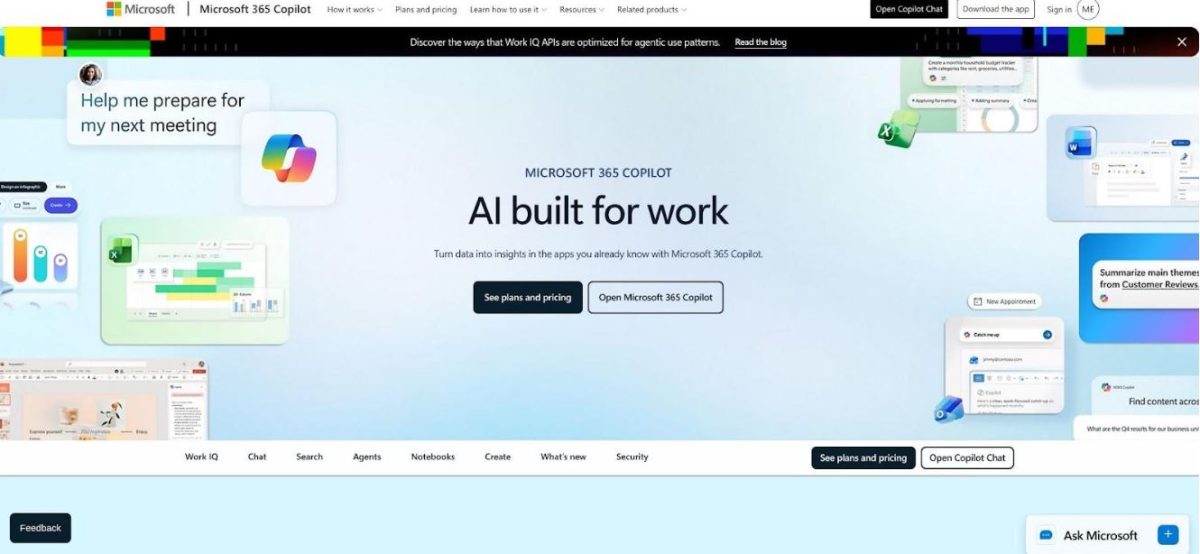
Microsoft 365 Copilot pane in PowerPoint generating slide content
Where Copilot shines is context. Because it speaks fluent Excel, you can highlight a forecast sheet, ask, “Explain the variance drivers,” and pull an annotated waterfall onto a slide without exporting a cell. Need speaker notes? Ask for supply-risk talking points, and they appear, ready for rehearsal.
Security objections are rare. Copilot inherits the compliance rules your Microsoft 365 admin already enforces, so sensitive demand data never leaves the tenant. That fact often convinces cautious IT teams faster than any demo.
There are hurdles. Access costs about thirty dollars per user each month, which can stretch budgets outside executive ranks. Generated charts stay within PowerPoint’s standard set, so you will not see a Marimekko or complex timeline without another plug-in. Treat Copilot like a smart assistant: strong on first drafts and summaries, less gifted at bespoke design.
If your team lives in Microsoft 365, Copilot is the shortest path from raw data to a presentable narrative. Pair it with a specialist chart add-in—think-cell is next—and you cover both analysis and aesthetics in one workflow.
#4 DataPoint: keep slides fed by live data
Yesterday’s numbers expire fast. DataPoint fixes that by wiring your PowerPoint shapes—text boxes, tables, and charts—directly to the sources that matter: Excel, SQL, SharePoint, and APIs.
DataPoint live-data PowerPoint dashboard screenshot
Set-up feels like adding formulas. We bind a cell on the slide to a database query, pick a refresh interval, and save. From that moment on, the deck breathes. Open it five minutes before the ops huddle and yesterday’s stock turns have already rolled to this morning’s cut. No copy-paste, no fat-finger risk, no “sorry, the figure changed” caveats.
The gain is huge for recurring dashboards. Analysts who once spent Monday mornings hunting fresh pick-pack-ship numbers now let DataPoint sweep the warehouse tables while they prepare insights. On factory-floor kiosks, slides loop all day, pulling live temperature or throughput readings every sixty seconds so supervisors act in real time.
There are caveats. Configuration is more technical than most add-ins; writing a solid SQL filter usually calls for IT. The licence also costs more, reflecting its industrial focus. Compare that to an engineer’s weekly slog updating fifteen safety KPI slides, and it pays for itself quickly.
If your biggest headache is stale data, DataPoint turns PowerPoint from static document into living dashboard, no extra BI software needed. Next, we move to a charting powerhouse trusted by consultants and finance chiefs alike.
#5 Datawrapper: give your numbers a newsroom gloss
Some data sets deserve more than the standard blue bar chart. They need design that turns raw columns into a story the audience remembers. That is where Datawrapper steps in.
Click the add-in, paste a table, and the familiar editor opens in a pane. Twenty seconds later a slope graph, heat map, or county-level choropleth appears, styled like something from The Economist. Back on the slide, the graphic lands as razor-sharp vector art that survives projector zooms and last-minute colour tweaks.
For operations teams, that polish matters. Picture a capacity-by-region map that shows red zones where demand outpaces labour, or a bullet chart that highlights on-time delivery against target. Stakeholders need no legend; the design directs eyes to the outliers.
Datawrapper’s secret weapon is range. PowerPoint offers a dozen chart types. Datawrapper offers more than twenty, each with thoughtful defaults and accessible colour palettes. Every element stays editable in the pane, so brand colours or font swaps take seconds.
Trade-offs exist. The graphic is a high-quality snapshot, not a live feed. If tomorrow’s numbers shift, reopen the editor, drop in fresh data, and re-insert. For weekly or quarterly decks that is fine. If you need minute-by-minute refresh, save Datawrapper for the executive readout slide and rely on a live-data tool elsewhere.
Security needs a check too. On a free plan, charts live on Datawrapper servers and are technically public, though unlisted. Sensitive supply-chain data should flow through a paid or self-hosted tier that keeps visuals private. Many enterprises already approve Datawrapper for web reporting, so the groundwork may be done.
Bottom line: when the story hinges on a chart’s visual punch, Datawrapper is the fastest path to professional-grade graphics without hiring a designer. One polished chart often carries a meeting further than ten busy slides. Up next, we look at a plug-in that keeps those KPI numbers fresh by the minute.
#6 Lucidchart: diagrams that speak louder than bullets
Picture the last time you mapped a warehouse process with PowerPoint shapes. Boxes slid off gridlines. Arrows tangled like spaghetti. Ten minutes later, the diagram looked more like abstract art than a flow.
Lucidchart fixes that headache. The cloud editor lives inside PowerPoint as a side panel. We open it, drag professional shapes onto an infinite canvas, and watch complex flows snap into tidy alignment. One click drops the finished diagram onto the slide as a crisp image. It stays on brand and never blurs.
Supply-chain teams value Lucidchart for three reasons.
First, speed. Value-stream maps, swim lanes, or decision trees appear in minutes. We import a CSV of roles and instantly produce an org chart for the new distribution hub. Edits are just as quick: change the source diagram in Lucidchart, press Update in PowerPoint, and every linked slide refreshes before the meeting starts.
Second, shared truth. Because diagrams live in the cloud, colleagues refine the same process map without version chaos. Comments replace email chains. When packaging engineering updates a step, transportation sees it right away.
Third, clarity. Icons for trucks, databases, and forklifts replace vague rectangles, so executives grasp the flow at a glance. No more explaining that the green box is the WMS, not a pallet.
Limits exist. Lucidchart will not chart inventory numbers or pull live KPIs. If your data is ultra-sensitive, IT may prefer on-prem Visio over any cloud tool. For visualising how work moves from supplier dock to store shelf, though, Lucidchart remains the fastest route to a clean diagram.
Next in the countdown: a free add-in that turns plain charts into publication-quality visuals.
Find your best-fit tool in 30 seconds
- If live numbers keep you up at night, choose DataPoint. It connects slides to databases continuously and saves hours when KPIs move hourly.
- Need advanced chart types that impress a board review? Go with Think-Cell. Nothing else here draws waterfalls or Marimekkos this cleanly or this quickly.
- Drowning in process diagrams—warehouse flows, approval loops, org charts? Lucidchart turns chaos into tidy visuals and keeps them editable in the cloud.
- Crave newsroom-grade styling for one-off reports? Pick Datawrapper. It turns bland bars into eye-catching slopes, maps, and heat grids without a design degree.
- Want an AI co-pilot that already understands your Microsoft files and security policies? Microsoft 365 Copilot is the natural add-on.
- Need an entire deck drafted, branded, and 80 percent ready before the meeting reminder pops up? Nothing beats Plus AI.
Choose the line that sounds like your day, install the matched add-in, and reclaim your time.
At a glance: the scorecard
You have the stories; now see how the tools stack up. The table below distils the six evaluation factors into a quick-read cheat sheet—perfect for forwarding to your manager or bookmarking for budget season.
| Tool | Ease of use | Data integration | Viz depth | AI / automation | Price* | Security fit |
| Plus AI | ⭐⭐⭐⭐ | ⭐⭐ | ⭐⭐ | ⭐⭐⭐⭐ | $ | SOC 2 cloud |
| Think-Cell | ⭐⭐⭐ | ⭐⭐ | ⭐⭐⭐⭐ | ⭐ | $$ | Local only |
| Microsoft Copilot | ⭐⭐⭐⭐ | ⭐⭐⭐ | ⭐⭐ | ⭐⭐⭐ | $$ | M365 tenant |
| DataPoint | ⭐⭐ | ⭐⭐⭐⭐ | ⭐ | ⭐⭐⭐ | $$ | Local connect |
| Datawrapper | ⭐⭐⭐⭐ | ⭐ | ⭐⭐⭐⭐ | ⭐ | Free–$ | Cloud / private |
| Lucidchart | ⭐⭐⭐ | ⭐⭐ | ⭐⭐⭐ | ⭐ | Free–$ | SOC 2 cloud |
*Price shows approximate per-user monthly cost tiers. One dollar sign equals less than twenty dollars; two equals twenty to forty dollars; three equals forty to sixty dollars; four equals more than sixty dollars.
Use the matrix as a conversation starter, not gospel. Your mileage will vary by workflow, data policy, and design standards. The ratings, however, explain at a glance why Plus AI tops automation, why Think-Cell owns visual depth, and why DataPoint’s higher fee buys live-data plumbing others skip.
FAQ: clearing the last hurdles
Will these add-ins slow PowerPoint to a crawl?
Not in normal use. Think-Cell and Lucidchart sit idle until you invoke them. Plus AI and Copilot off-load heavy lifting to the cloud, so your laptop stays cool while the AI works. The only caution is DataPoint: connect it to a giant SQL view that refreshes every minute and the file grows; set sensible intervals and you are safe.
Is my data safe in a cloud-based add-in?
Yes, provided you pick the right tier. Plus AI holds a SOC 2 Type II report, Lucidchart and Datawrapper match that on paid plans, and Copilot never leaves Microsoft’s secure tenant. Need zero cloud? Think-Cell and DataPoint process everything locally.
We already use Power BI. Why bother with another plug-in?
Power BI’s own PowerPoint add-in embeds interactive reports, but it does not rewrite text, draw a waterfall, or update a process flow. Most teams explore data in Power BI and still need slides for the story. The tools above close that last mile.
Can I mix more than one of these tools in the same deck?
Absolutely. The most common combo is Plus AI for a first draft, Think-Cell for precision charts, and DataPoint on the KPI slide that must stay live. They coexist peacefully on the ribbon.
Which one pays for itself fastest?
If you spend hours each week re-charting variances, Think-Cell wins. If your headache is repetitive deck creation, Plus AI or Copilot repay the licence in a couple of saved afternoons. For plant-floor dashboards, DataPoint beats hiring a developer to build a custom screen.
Still have a question we did not cover? Drop it in the comments and we will chase the answer.
Wrap up: turn hours into insights, not slides
We opened with a sobering fact: more than one third of presentation prep time still vanishes into manual chart wrangling. It does not need to stay that way. The six tools above give you a tailored fix, whether you need AI speed, live data, designer-grade visuals, or strict compliance.
Pick the pain point that steals the most time, install the matching add-in, and track the hours you save over two reporting cycles. Share that delta with leadership. When the numbers show real gains—think three to five hours reclaimed each week—expanding the licence becomes an easy sell.
Technology is not the goal. The goal is sharper decisions because you spent your energy on analysis and storytelling, not on nudging labels or chasing last-minute numbers. Let the slides build themselves so you can focus on the work that moves the business forward.
 SAP Joins CEO Carbon Neutral Challenge
 MACH Alliance Unites Leading Technology Providers To Build the Agent Ecosystem, the Future of Enterprise AI
 Sana Commerce among the first e-commerce solution providers to support SAP Business One Cloud integration
 Rethink Digital Transformation with OpenText Cloud Edition 20.4
 Content Strategy: 3 Reasons Why You Need One